
In an era of ballooning national debts, where headlines scream about the U.S. owing $38 trillion, Japan surpassing $10 trillion, or global debt hitting $300 trillion, it’s easy to want to panic. Those eye-watering figures often make the news cycle, fueling doomsday predictions of economic collapse, hyperinflation, or generational theft.
Why Debt-to-GDP Ratio Matters More Than the Raw Number of Trillions
But here’s a counterintuitive truth: the absolute amount of debt a country carries is often a red herring. What truly signals whether a debt burden is sustainable isn’t the sheer size of the number, but how it stacks up against the size of the economy it’s meant to serve. Enter the debt-to-GDP ratio: a simple metric that cuts through the noise and reveals the real story.
Focusing on total debt alone can mislead policymakers, investors, and citizens alike, while the debt-to-GDP ratio offers a clearer lens on fiscal health. Let’s break down the mechanics, unpack real-world examples, and address why this ratio isn’t a perfect predictor, but still the best tool we have for judging solvency.
The Trap of Absolute Debt: Size Isn’t Everything
Imagine two neighbors: one is a tech billionaire with a $100 million mortgage on a sprawling estate, the other a middle-class family with a $300,000 loan on a modest home. The billionaire’s debt is 333 times larger in raw dollars, yet neither is panicking over the payments because their incomes comfortably cover them. Scale the analogy up to nations, and the flaw in obsessing over absolute debt becomes glaring.
Total debt figures sound alarming because they’re designed to. A $38 trillion U.S. national debt evokes images of a ledger book bursting at the seams. But without context, it’s meaningless. Why? Because economies aren’t static piggy banks; they’re dynamic engines that grow, innovate, and generate wealth. A trillion dollar debt in 1980 was catastrophic for many countries; today, it’s routine for major powers.
Consider the pitfalls of the absolute view:
- Ignores Economic Scale: The U.S. economy, with a GDP of about $28 trillion in 2025, dwarfs that of, say, Greece ($220 billion). If both racked up $1 trillion in new debt, the U.S. could more easily shrug it off, while Greece would be crippled. Absolute debt treats a gnat and an elephant as equals.
- Overlooks Growth Potential: Debt isn’t a snapshot; it’s a trajectory. A growing economy can outpace its debt through higher tax revenues, productivity gains, and inflation that erodes real borrowing costs. Absolute totals freeze-frame the problem, blind to this expansion.
- Breeds False Equivalence: Global debt comparisons are apples-to-oranges without adjustment. China’s $10 trillion debt seems neck-and-neck with Japan’s, but China’s GDP is over $18 trillion versus Japan’s $4 trillion. The raw numbers can obscure who’s really strained.
In short, absolute debt is like weighing yourself without considering your height or muscle mass. it’s a number without insight.
The Debt-to-GDP Ratio: A Smarter Yardstick
The debt-to-GDP ratio flips the script by expressing public debt as a percentage of gross domestic product (GDP), the total value of goods and services produced in a year. Formula-wise, it’s straightforward: Debt-to-GDP = (Total Public Debt / GDP) × 100
A ratio below 60% is often seen as “prudent” under frameworks like the European Union’s Maastricht Treaty, which was supposed to limit a member nation’s debt to 60% of GDP and their annual deficit to no more than 3% of GDP. Today several member nations (France, Belgium, Italy, Greece and Spain) have significantly exceeded those thresholds.
At the same time, anything over 90-100% raises concerns, per studies from economists like Carmen Reinhart and Kenneth Rogoff. Why does this matter so much?
It Measures Affordability, Not Just Accumulation
At its core, the ratio gauges whether a government can service its debt without derailing the economy. Interest payments on debt aren’t paid from a magic vault; they’re funded by taxes, which stem from GDP. If debt is 50% of GDP, and interest rates are 3%, the annual bill is about 1.5% of GDP, which is manageable if growth hums along at 2-3%. But if debt balloons to 150% of GDP, that same rate chews up 4.5% of output, crowding out spending on things like schools, roads, or defense.
This affordability test is why the ratio drives markets. Bond investors watch it like hawks. A spiking ratio signals higher default risk, pushing up yields and borrowing costs in a vicious cycle.
In 2025, with U.S. debt-to-GDP hovering around 120%, investors aren’t fleeing because growth projections (2%+ annually) suggest the economy can carry the load, at least for now. Contrast that with absolute debt panic, which ignores this nuance.
It Benchmarks Across Time and Borders
Ratios level the playing field. Historically, the U.S. debt-to-GDP peaked at 106% right after World War II, higher than today’s level, yet it fell to 30% by the 1970s through robust growth, not austerity. Japan, with the world’s highest ratio (over 250%), hasn’t imploded because its domestic savings and low rates keep servicing cheap. Meanwhile, absolute debt laggards like resource-rich Australia maintain a healthy 50% ratio with a total GDP of about $1.7 trillion GDP.
Cross-country, it exposes vulnerabilities. Italy’s 140% ratio amplifies its sluggish growth woes. Without ratios, we’d miss how emerging markets like India with a debt-to-GDP around 85% are faring better than stagnant high-debt peers.
It Signals Policy Red Flags
High ratios aren’t just numbers; they’re sirens for reform. When they climb, governments face pressure to boost growth (via investment) or cut deficits (via taxes/spending trims). The ratio’s beauty is its forward-looking nature: a stable or declining one, even with rising absolute debt, reassures.
Economists like Olivier Blanchard argue ratios above 80% can also slow growth by 1% annually due to confidence erosion.
Real-World Lessons: When Ratios Rescue the Narrative
History is littered with ratio-savvy turnarounds. Post-WWII America borrowed massively in absolute terms, debt soared from $258 billion in 1945, but GDP exploded via the post war industrial boom, slashing the ratio. By 1960, it was half its peak.
Fast-forward to the Eurozone crisis: Greece’s absolute debt ($400 billion) was modest globally, but its 180% ratio triggered default fears, bailouts, and austerity. Ireland, with a similar absolute load but a 120% ratio and tech-driven rebound, recovered faster.
In 2025, as AI investment propels GDP forecasts, countries like the UK with debt-to-GDP nearing 100% eye ratio relief. Absolute debt will likely rise, but if growth outstrips it, fiscal hawks can exhale.
The Ratio’s Limits: Not a Crystal Ball
To be fair, debt-to-GDP isn’t flawless. It assumes GDP growth is steady, but recessions ensure it isn’t. It also ignores private debt spillovers, and glosses over inequality, as wealthy nations borrow in their currency, easing burdens via printing money, unlike dollar-dependent emerging markets. Reinhart and Rogoff’s infamous 90% debt-to-GDP “tipping point” was critiqued for spreadsheet errors, but the overall theme seems accurate.
The US Fiscal Picture: How Did We Get Here
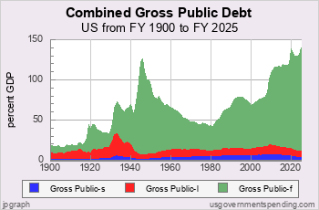
Today the total US Federal debt when including intragovernmental debt, is around 120% of GDP, which is an all-time high. Looking at the chart above we can see in green the total Federal debt. While the State public debt is illustrated in red, and local government debt is in blue.
So how did we arrive at such elevated levels? The debt is increased every year by the amount of the Federal deficit. This is the difference between the amount of money the government collects in total revenue, and the total Federal outlays, aka congressionally approved spending.
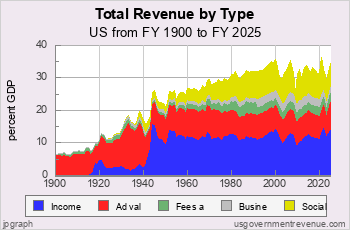
Tax Revenue
A common theme is the notion that tax revenues are to blame. However, there is little evidence to back this up. Federal revenues have been fairly consistent in recent decades when also measured as a share of GDP, and since the 1980’s have been higher than in past decades.
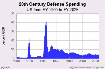
Defense Spending
Many often cite the defense budget as a major contributor to the growth in the US debt-to-GDP ratio. It’s easy to see why, as it seems there have been an endless number of wars in which the US was either directly involved, or funding at least one side of many global conflicts. But when measuring the defense budget as a share of GDP, it has actually remained fairly consistent since the 1990’s, and far less than it was in the 1960’s.
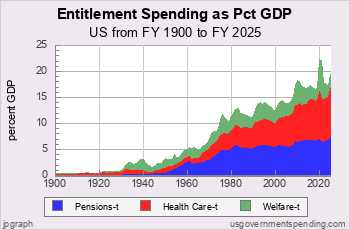
Entitlement Spending
Outlays have become a problem. The Federal budget has grown substantially in not just absolute dollars, but also as a share of GDP. The most problematic is that of entitlements. Looking at the graph below, we can see that total entitlements have grown from what was 2% of GDP to more than 20% of GDP. Most of these entitlements are now legal obligations that are not subject to vote in annual congressional spending proposals. In the mid 1960’s the US began on a course of significantly increased entitlement spending as part of the “Great Society” plan of the Johnson administration. By the late 1970’s we began to see ballooning debt levels as a share of GDP as these obligations began to grow in concert with much higher inflation. That higher inflation led to substantially higher interest rates in the early 1980’s, which further compounded the debt issue as the cost to service the debt rose with higher rates.
Focus on the Horizon, Not the Hill
The size of the US debt-to-GDP ratio may not be an immediate problem, as the US is still the largest and most powerful economy in the world. However, nothing lasts forever, and US economic dominance is not a perpetual forgone conclusion. The trajectory must change, or the economic stability and status of the US will be challenged in time. The trillions piling up aren’t the villain; mismanagement is. By prioritizing debt-to-GDP, policy makers need to shift from fearmongering to strategy. This is going to eventually mean significant but gradual entitlement reforms, as well as encouraging investment in research and development, and much needed US infrastructure improvements to ensure GDP grows faster than borrowing.
About the Author
Joseph M. Favorito, CFP® is a Certified Financial Planner® as well as the founder and managing partner at Landmark Wealth Management, LLC, a fee-only SEC registered investment advisory firm. He specializes in helping individuals and families develop comprehensive financial strategies to achieve their long-term goals.