
The P/E ratio measures how much investors are willing to pay per dollar of a company’s earnings, serving as a key gauge of valuation optimism or potential overvaluation. The top 10 stocks, typically dominated by mega-cap leaders in technology and growth sectors, have consistently traded at a premium to the broader group, but the gap has widened dramatically in recent years.
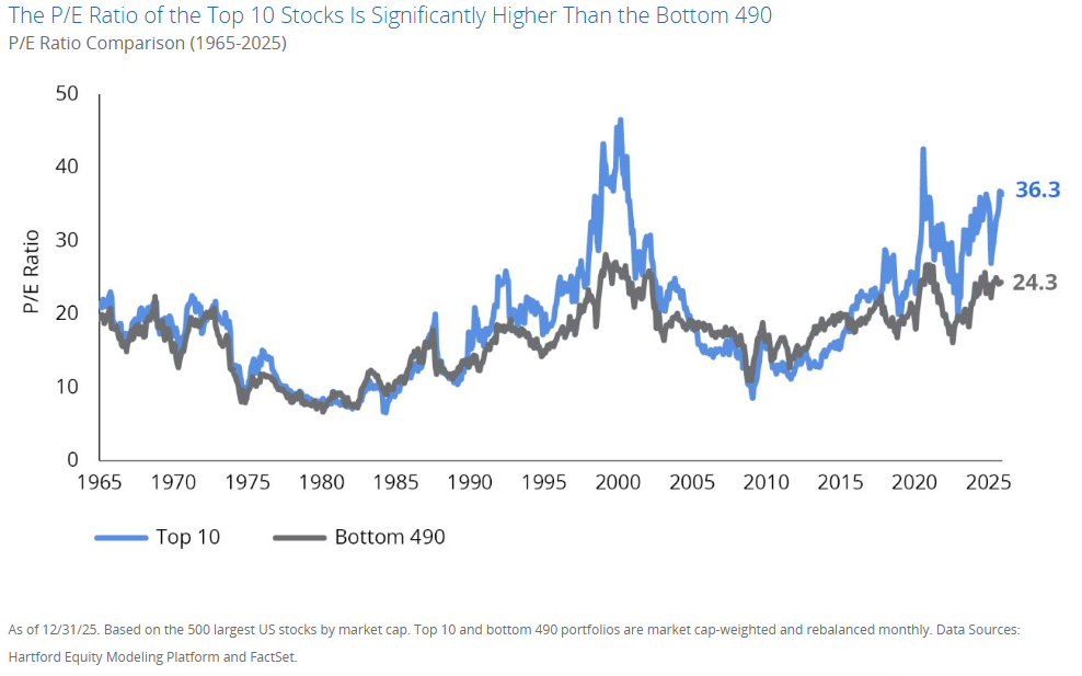
Looking at the chart above sourced from the Hartford Equity Modeling Platform and FactSet, we can see two lines. One that represents the P/E of the top 10 companies, and another line that represents the P/E of the other 490 companies.
- Historical Context: For much of the period from the late 1960s through the early 2010s, the two lines moved relatively in tandem, often hovering between 10 and 25–30. Peaks occurred during bubbles, such as the late 1990s dot-com era (where the top 10 spiked toward 45+), and brief dips during recessions or corrections.
- Recent Surge: Starting around the mid-2010s, the P/E of the top 10 began pulling away sharply, accelerating post-2020 amid tech-driven growth, AI enthusiasm, and low interest rates. By December 31, 2025, the top 10 portfolio stood at 36.3, while the bottom 490 remained at a more modest 24.3.
- The Gap: This represents a significant premium, roughly 50% higher for the top 10, marking one of the widest disparities since the dot-com peak (excluding the distorted COVID-19 period when earnings were temporarily depressed).
The portfolios are market-cap weighted and rebalanced monthly, reflecting real-world index dynamics like those in the S&P 500 (where the top holdings have grown to represent around 35–40% of the index in recent years).
What This Divergence Tells Us
This valuation split highlights extreme market concentration. A handful of dominant companies, often referred to as the “Magnificent Seven” or similar mega-caps (e.g., Apple, Microsoft, Nvidia, Amazon, and others) have driven much of the market’s gains through superior earnings growth, innovation in AI and digital infrastructure, and strong competitive moats. Investors have rewarded them with higher multiples, betting on continued outsized expansion.
Meanwhile, the bottom 490 (encompassing a wide range of sectors like industrials, financials, consumer goods, and smaller large caps) trade at more “normal” historical levels, closer to long-term averages. This suggests:
- The broader market (ex-top 10) appears relatively reasonably valued or even undervalued on a relative basis.
- The overall S&P 500’s headline valuation is elevated largely because of these top-heavy weights, masking more moderate pricing in the majority of stocks.
Analyses from sources like Hartford Funds note that such extremes in relative valuations (top 10 vs. bottom 490) have historically preceded periods where the broader group outperforms, with the bottom 490 delivering excess returns of around 2% annually over the following five years on average in similar top-decile valuation setups.
Implications for Investors
This chart serves as a cautionary reminder that concentration carries risks. While the top stocks have justified their premiums with real earnings power (unlike some past bubbles), the wide gap raises questions about sustainability, especially if growth expectations moderate, interest rates shift, or AI-related hype cools.
- Diversification Opportunity: Passive index investors are heavily exposed to these top names. Strategies tilting toward equal-weighting, value, or the broader market could capture potential mean reversion.
- Not Necessarily a Bubble Signal: Unlike the dot-com era’s more extreme multiples (often 40–50+ for leaders), today’s top group benefits from stronger fundamentals, but the relative premium still stands out historically.
- Long-Term Perspective: Markets cycle through concentration phases. After periods of top-heavy dominance (e.g., post-2000 or post-2008), leadership often broadens, rewarding patient investors in overlooked areas.
In summary, the chart captures a defining feature of the current market landscape: a two-tiered U.S. equity market where an elite group commands premium pricing, while the rest trades at more grounded levels. As we move into 2026, monitoring whether this gap narrows through broader earnings growth or adjustments in the mega-caps will be key to understanding the next phase of market performance.
At Landmark, we attempt to broadly diversify portfolios away from just these types of concentrations that pose potential portfolio risks.
About the Author
Joseph M. Favorito, CFP® is a Certified Financial Planner® as well as the founder and managing partner at Landmark Wealth Management, LLC, a fee-only SEC registered investment advisory firm. He specializes in helping individuals and families develop comprehensive financial strategies to achieve their long-term goals.