Do Dividend Payers Outperform?

In 2024, more than 75% of S&P 500 stocks pay a dividend of some amount. Today the overall weighted dividend yield of the index is about 1.40% annually. However, the historical yield has been much higher. A look back at recent decades tells us the following:
Between 1871-1960 the S&P 500 stocks never had a yield below 3%.
Between 1970-1990 the S&P 500 stocks yielded closer to 4%.
Between 1991-2007 the S&P 500 yielded on average about 1.90%.
During the 2008 financial crash, the yield briefly spiked to 3.11% as stock prices declined quickly.
Between 2009-2019 the S&P 500 yield steadily increased to an average of 1.97%.
A stock’s yield is calculated by dividing the annual dividend per share by the current stock price, and then multiplying by 100 to convert it to a percentage. As a result, lower yields across the broad markets are a result of elevated stock prices.
Some companies pay stock dividends at a consistent rate, some try to consistently grow their dividend. However, over the decades, stocks that pay some form of a dividend, even if it is a nominal yield, tend to outperform stocks that don’t.
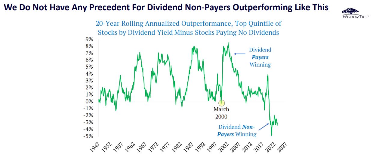
What we can see from the chart above courtesy of WisdomTree, is that when looking at a broader market picture of the Russell 1000 index, we are in somewhat uncharted territory. A time in which stocks that don’t pay dividends have very recently outperformed by the largest margin on record when compared to the top quintile of companies with the highest dividend yield.
Remember that in order to pay any kind of a consistent dividend income, a company is generally profitable, not just projecting future profitability. What this chart seems to demonstrate is that there are still a large number of very expensive companies in the market, and that is most likely concentrated on the large cap growth side of the S&P 500 and Russell 1000 indices.
As we have discussed in prior recent articles, while value stocks have better long-term performance than growth stocks, this has not been the case in recent history. For more than a decade, US large cap growth has outperformed. As a result, stocks in general today trade at more expensive levels.
The average price to earnings ratio (P/E) of the S&P 500 is today about 23.99. Looking back at years past we find the following:
During most of the 1970’s and into the early 1980’s, with higher interest rates, the S&P 500 traded at a P/E ratio of less than 15.
During the tech bubble of the late 1990’s the P/E ratio of the S&P 500 remained closer to 30.
After the 2000 tech wreck, P/E ratios came back down to closer to the 15 range.
Immediately following the 2008 financial crisis, P/E ratios on the S&P 500 fell back towards a ratio of closer to 15.
Then as interest rates remained close to zero from 2009 until 2017, we saw P/E ratios begin to steadily increase back toward the high 20’s again.
P/E ratios have demonstrated a direct inverse relationship with interest rates. The theory is that when there is a lower rate of earnings on fixed income, it begins to make more sense to pay more for earnings.
However, now we are back to a 5% plus interest environment, which has not been seen since 2007. We would argue that on a historical basis, this is a more normalized rate environment. If rates were to stay here, or higher for a prolonged period, then one can assume that looking at the historical record, P/E ratios should decline. That would mean that stocks need to either decline or grow slower.
Such an environment would likely favor dividend paying companies that are more value oriented. Ultimately, there is always a “reversion to the mean” at some point in time, although none of us can predict the short-term with any degree of accuracy. However, at least the current data does suggest that we may be moving into an environment that favors such dividend paying value companies as compared to growth stocks.


